Made in the UK
Trade Pricing
Fast Lead Time
Easy Ordering


Blog / How To Design Effective Business Signage
Posted on-
April 7, 2026 14:33
A well-designed business sign does three things at once: it makes you visible, tells passers-by what you do, and gives them a reason to walk in. Get any one of those wrong and your commercial signage stops earning its keep, no matter how much you spent on it.
The good news is that effective sign design isn't guesswork. There are clear, tested rules around size, colour, font, material and placement that turn a forgettable shopfront into one customers actually notice. In this guide we'll walk through every one of them, with UK-specific notes on planning permission, listed buildings and accessibility, plus a design checklist you can run your own ideas through before you order.
The most common mistake we see in shop signs is making them too small. A beautifully designed sign that nobody can read from across the street is a missed opportunity, and it's almost always down to undersized lettering.
The simple rule of thumb to plan around: for every 3 metres of viewing distance, your text needs to be at least 25mm tall. A shop sign that needs to be readable from 30 metres away should carry lettering at least 250mm tall. Anything smaller and people walking the high street simply won't pick it up at the moment they're deciding whether to step inside.
Your business name is the hero, but secondary information like a tagline, opening hours or "established 1985" should be set at roughly half the cap height of the main name. Anything less and it disappears. Anything bigger and it competes with the headline.
Colour is where good business sign design and good brand design occasionally pull in opposite directions. Your brand colours might look beautiful on screen, but if they're tonally similar they'll wash out the moment your sign is hit by overcast UK daylight.
The fix is contrast. Pair a dark colour on a light background or a light colour on a dark background, and you'll have a sign that holds up in every lighting condition the British weather can throw at it.
Light grey on white, yellow on cream, pastel on pastel and red on blue all fall apart at distance. They might pop on a screen but they're effectively invisible on a high street in February. If you're not sure, print a test panel and view it from across the road in dull light before you commit.
Fonts are where most DIY sign designs come unstuck. The temptation is to pick something with character, something that looks unique. The problem is that character and readability are usually at war with each other.
For a business sign, readability wins every time. People only have a couple of seconds to clock your name as they pass. The fonts that make those seconds count are almost always cleaner than you'd think.
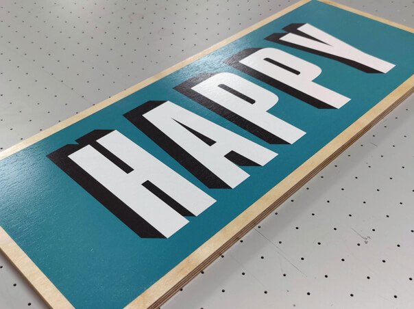
Helvetica, Futura, Montserrat, Gill Sans and similar sans-serifs are the workhorses of effective signage. They're clean, geometric and stay legible at every size. If you only learn one rule from this guide, make it this: when in doubt, use a sans-serif for your business name.
Serif fonts like Times, Garamond and Caslon can work beautifully for solicitors, accountants, traditional pubs and heritage retailers, but only at large sizes. The fine details of a serif disappear when the lettering shrinks below about 100mm cap height, so they're best reserved for a generous fascia rather than a tight projecting sign.
Script fonts, brush styles and bespoke decorative typefaces should never carry the primary business name. They're harder to read at distance, even harder in poor light, and they age quickly. Use them sparingly for a tagline or a single accent word, and let your sans-serif do the heavy lifting.
Material choice is where design meets reality. The right material protects your investment for years, looks the part, and matches the budget you've set. The wrong one fades, warps or simply doesn't suit the brand you're trying to build.
Here's how the most popular options stack up across the kinds of small business projects we handle every week.
| Material | Best For | Typical Lifespan | From |
|---|---|---|---|
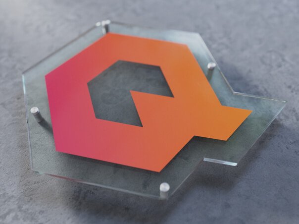
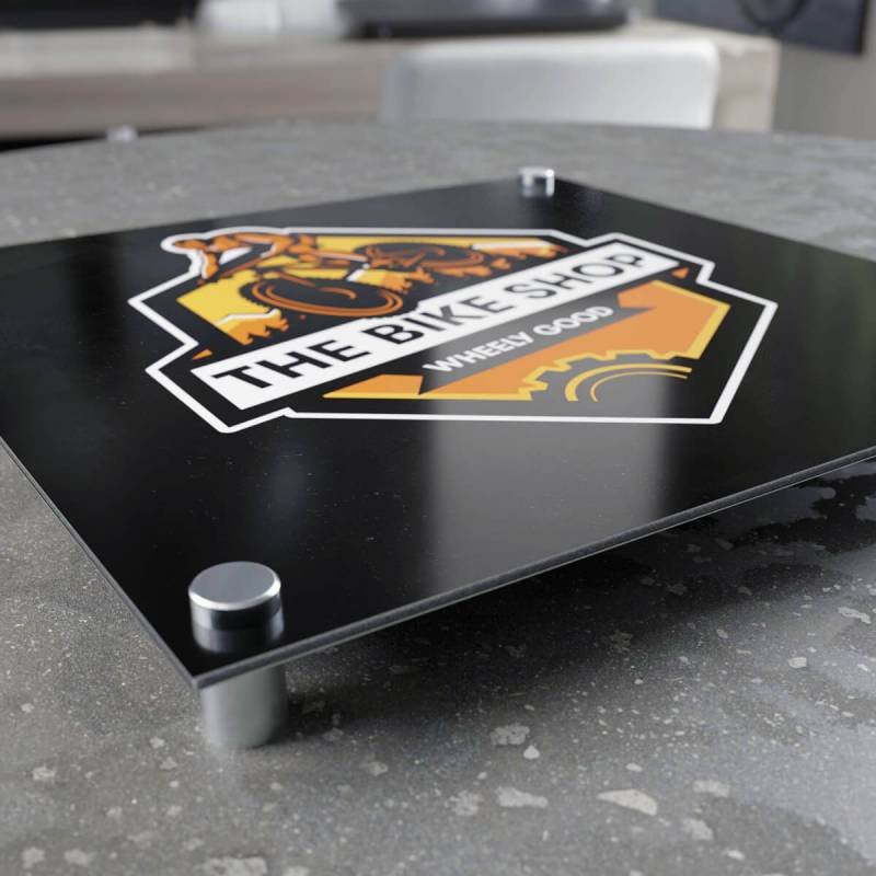
| Acrylic Signs | Modern interiors, premium reception signs, sheltered fascias | 5-7+ years | From £40 |
| Aluminium Signs | Permanent outdoor fascias, weather-exposed sites | 7-10+ years | From £180 |
| Wood Signs | Pubs, heritage brands, rustic and artisan businesses | 5-10 years with care | Project priced |
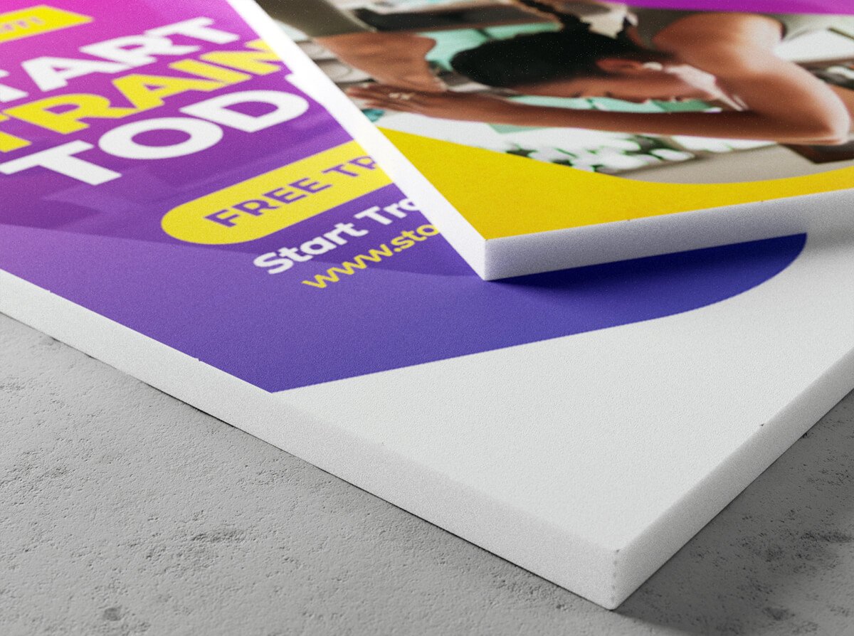
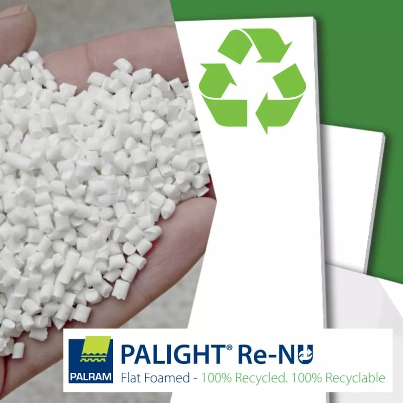
| Foam PVC Signs | Internal signage, short-term promotions, site boards | 1-3 years | From £25 |
| Metal (built-up) Signs | Premium fascias, corporate HQs, statement signage | 10-20+ years | Project priced |
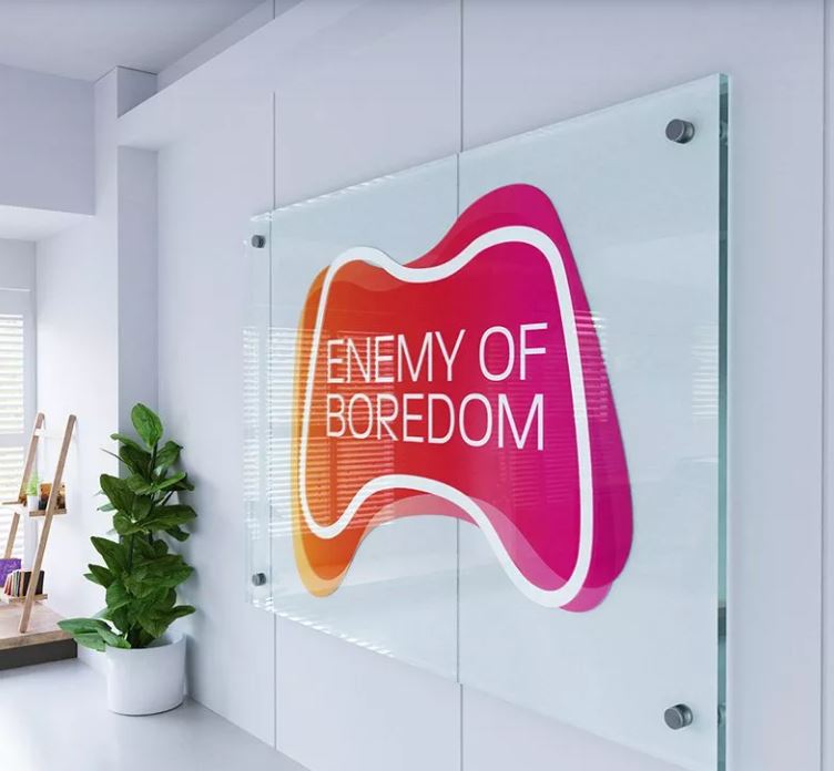
Acrylic is the modern all-rounder. It's clean, professional and tough enough for most indoor and sheltered outdoor uses. If you want a sleek contemporary look, this is usually where to start. Many of these options also feed into the 3D lettering range for added depth.
Aluminium is the workhorse for anything fully exposed to the weather. Powder-coated finishes resist UV, rain and frost for years, and the material is light enough for straightforward installation.
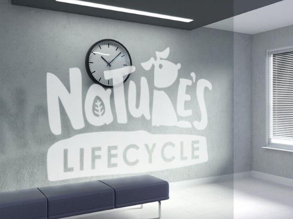
Wood brings warmth and character that no other material quite matches. It suits pubs, country businesses, garden centres and any brand leaning into heritage. Treated cedar or oak will last a decade outdoors with periodic recoating.
Foam PVC is the budget-friendly option for indoor signage and short-term outdoor work. It's not built for permanent outdoor display, but for site boards, event branding or internal directional signs it's ideal.
Built-up metal letters sit at the top end. They're an investment, but they project authority and longevity in a way that flat printed signs simply can't match.
A common trap in sign design is treating the artwork and the placement as separate decisions. They aren't. Where the sign sits dictates how it needs to be designed, and the best results come from planning both at the same time.
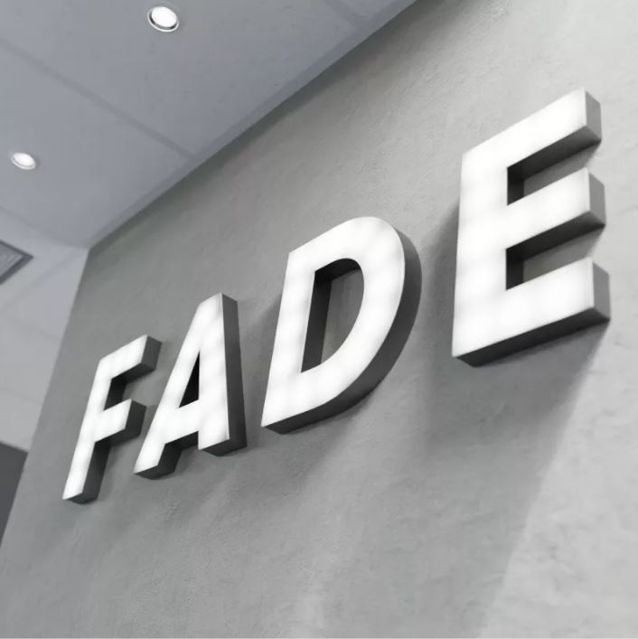
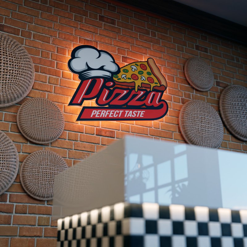
The fascia is your headline. It's the first thing seen from across the street and the last thing seen before someone walks in. Bold lettering, high contrast and considered illumination are essential. If your unit gets foot traffic after dark or through winter, LED signage isn't a luxury, it's the difference between visible and invisible.
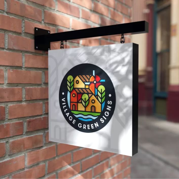
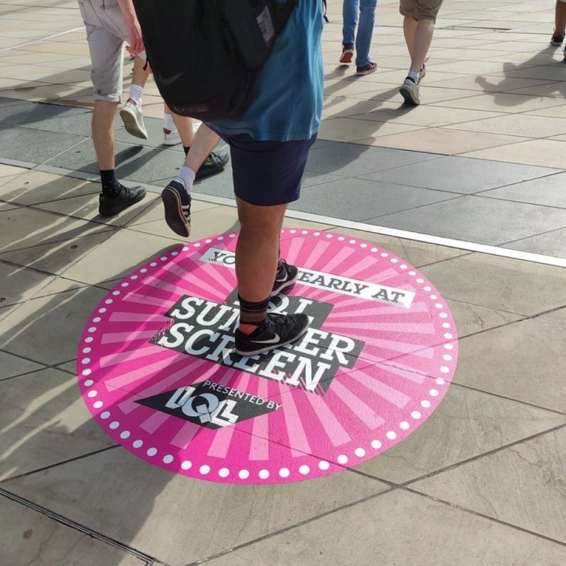
A hanging sign earns its keep by catching the eye of people walking parallel to your shopfront, who would otherwise miss a flat fascia entirely. Keep the design simplified, work to a small palette, and make sure the brand reads cleanly from both directions.
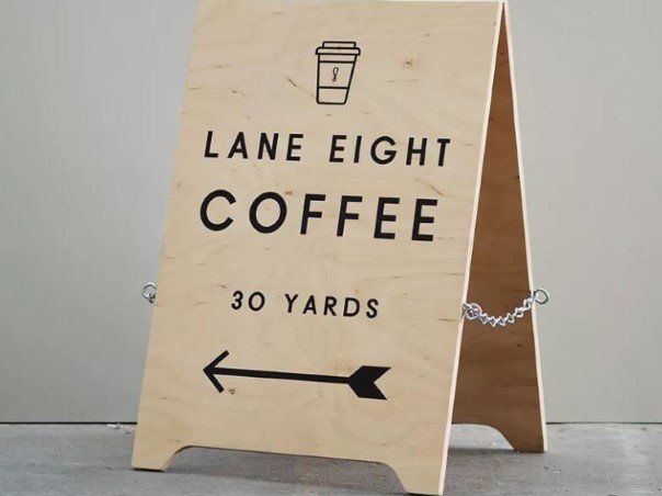
Window signage supplements the fascia with practical information like opening hours, services offered or current promotions. It's cheap, fast to update and adds a layer of detail without cluttering the main sign. Use frosted vinyl for privacy or full-colour print for impact.
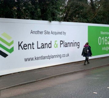
If your business is set back from the road, a freestanding totem or post-and-panel sign brings it forward. Totems start from around £1,990 fitted and are the right answer for trade counters, retail parks, garden centres and offices on business parks. They also double as effective wayfinding signage when you have multiple buildings or entrances.
Before any artwork is signed off, the regulatory side of UK signage deserves a few minutes of attention. Most standard business signs are perfectly straightforward, but there are situations where a quick check now saves a costly mistake later.
In England, advertisement control sits under the Town and Country Planning (Control of Advertisements) (England) Regulations 2007. Most standard fascia, projecting and window signs benefit from deemed consent, which means you don't need to apply for express permission. The system is set up to let typical business signage go up without bureaucracy.
The exceptions to watch for are conservation areas and listed buildings. If your premises sits in a designated conservation area, deemed consent rules tighten and some signs (especially illuminated ones) will need express Advertisement Consent from your local planning authority. If the building is listed, you may also need Listed Building Consent on top of Advertisement Consent. When in doubt, a five-minute call to your local planning department is the cheapest insurance you'll ever buy.
Illuminated signs, including LED fascia trays and built-up halo lit letters, need to be installed by a competent electrician and meet BS 7671 (the IET Wiring Regulations), which is the primary UK standard for commercial electrical installations. There's also a minimum clearance to think about: under Schedule 3 of the 2007 Regulations, signs projecting over a public footpath generally need at least 2.5 metres of clearance above ground level, so people can walk underneath safely.
The Equality Act 2010 requires service providers to make reasonable adjustments for disabled customers, and signage plays a real role in that. High-contrast text, sensible font sizes, clear directional signage, tactile or braille interior signs where appropriate, and consistent placement at readable heights all contribute. None of this is onerous, and most of it overlaps with good design practice anyway.
Before you sign off any business sign design, run it through this eight-point checklist. If you can answer "yes" to all eight, you're in great shape.
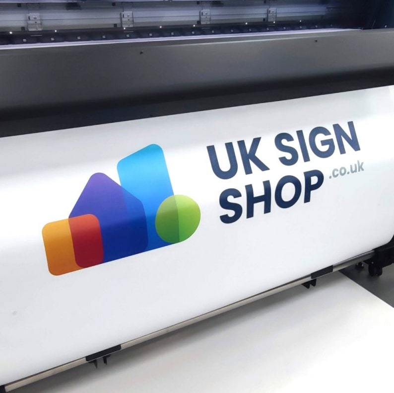
At UK Sign Shop every order includes a FREE artwork check as standard, so we'll flag anything in your design that doesn't pass this checklist before we cut a single sheet of material. With over 50 years of UK manufacturing experience and 500,000+ customers behind us, we know exactly where signs go right and where they go wrong, and we're not shy about telling you so you end up with something that actually works.
An effective business sign works when every decision (size, colour, font, material, placement and compliance) pulls in the same direction.
Get the size right and people can read you from where they actually walk. Get the contrast right and your sign holds up in real UK weather. Get the fonts right and your name reads in a glance, not in a squint. Get the material right and you protect the investment for years rather than months. Get the placement right and you catch eyes that would otherwise pass you by. And get the regulations right and you avoid an awkward conversation with the planning department six months in.
If you're ready to design a sign that ticks every box, use our online configurator to design yours and know exactly what you're getting before you buy. Every option is handcrafted in the UK, backed by our free artwork check, and built to last by a team that's been making signs for half a century.
High-contrast combinations work best: dark text on a light background (black on white, navy on cream) or light text on a dark background (white on black, gold on navy). Avoid tone-on-tone combinations like light grey on white or yellow on cream, which fall apart in overcast UK light. If your brand colours are too similar to work together, use a neutral background and reserve the brand palette for the logo and name.
Use the 25mm-per-3-metres rule. For every 3 metres of viewing distance, your lettering needs to be at least 25mm tall. A sign that needs to be readable from 30 metres away should carry lettering at least 250mm tall. High-street shops typically need 150-300mm cap heights, while roadside signage often needs 400mm or more.
If your business is open after dark, through winter evenings, or in a low-light location, illumination is well worth it. Modern LED signs are extremely energy efficient and they double the hours your sign is doing useful work. Illuminated signs in conservation areas may need Advertisement Consent, so check before you order.
Business sign costs vary widely depending on size, material, illumination and installation. Simple internal foam PVC boards sit at the affordable end, while fully illuminated freestanding totems sit at the premium end, with plenty of options in between. The best approach is to browse the full range, pick the style that suits your space, and design online to see live pricing before you commit.
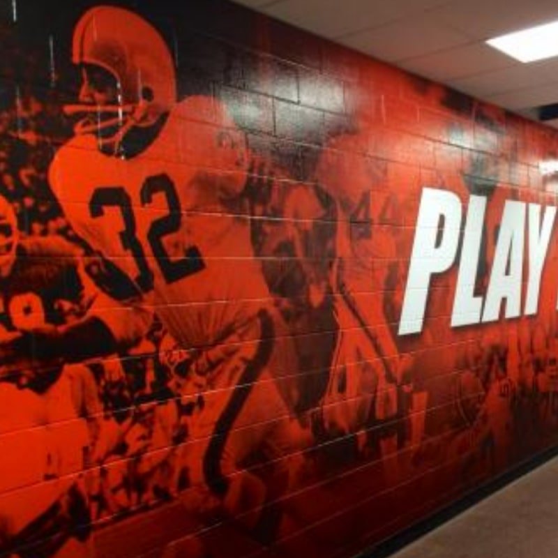
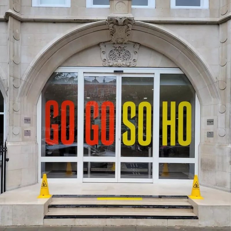
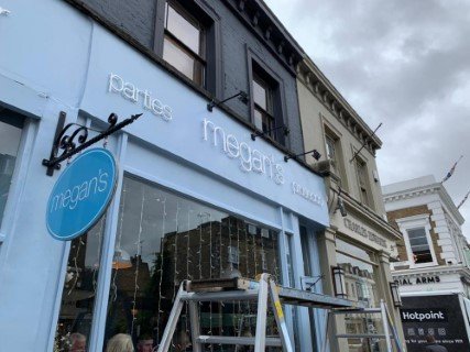
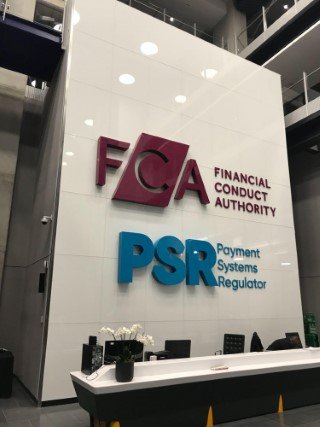
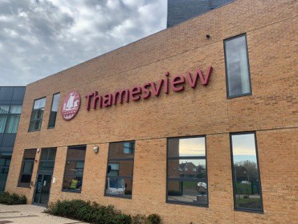
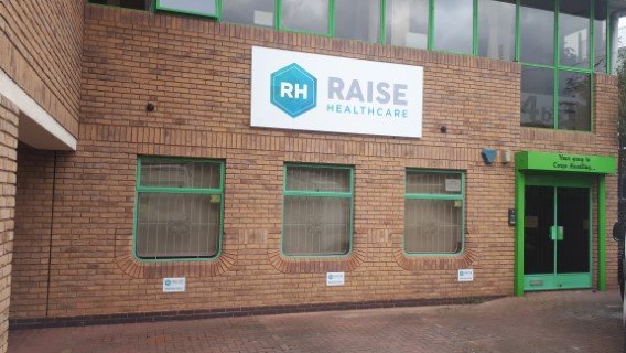
We've worked with some of the biggest brands in and around the UK.
Above are just a few of the brands we've been lucky to have worked closely with to create bespoke and unique signage fabrications.
